Validated by Teachers. Killed by Budget.
A cross-functional initiative to replace physical classroom activities with a digital game: greenlit by the product team, loved by teachers in testing, and deprioritized when budget went elsewhere.
UX/UI Design
〰️
Prototyping
〰️
Design Strategy
〰️
UX Research
〰️
Accessibility
〰️
UX/UI Design 〰️ Prototyping 〰️ Design Strategy 〰️ UX Research 〰️ Accessibility 〰️
Duration:
6 Months
Role:
Senior Product Designer (Lead)
Team:
2 Designers, 1 PM, 1 UXR, 3 Dev, 2 Content
Task:
New feature discovery
Challenge
Business Opportunity
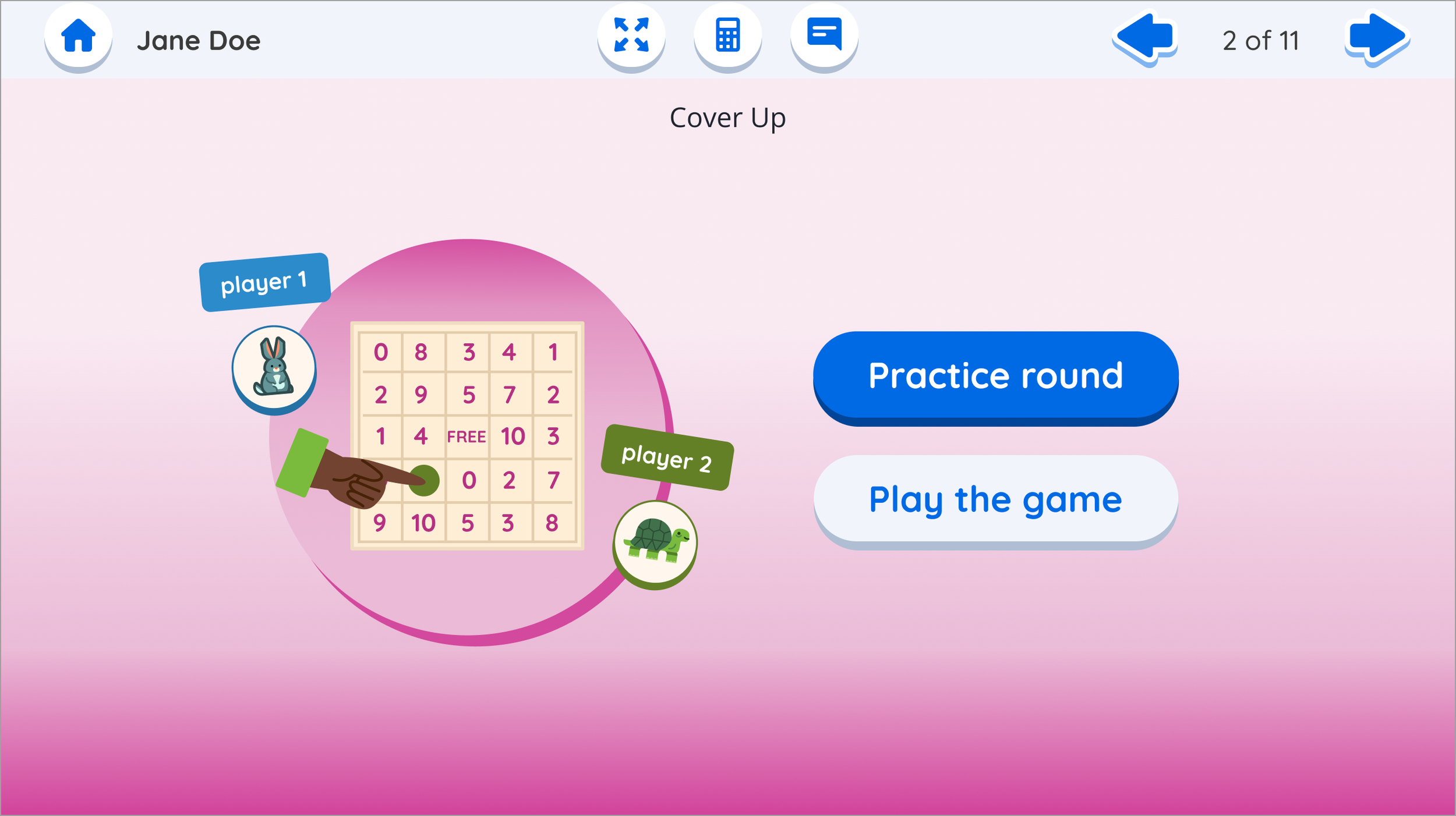
Centers are hands-on math games built into Amplify's K-5 curriculum, designed for students to play collaboratively while teachers run small group intervention sessions elsewhere in the classroom. Teachers love them. But the print version came with real friction: 2+ hours of weekly prep, no easy way to model the game for students, and no way to monitor whether students were actually playing correctly while attention was divided.
I led the design of Digital Centers, the first collaborative, single-device experience ever designed at Amplify. A concept that caught senior leadership's attention when I presented it, with leaders noting they were impressed the team had thought through this entirely new type of experience.
The pain points were consistent across teacher interviews:
2+ hours of weekly prep, cutting into already limited planning time
No efficient way to demonstrate or model the game before students play independently
No visibility into whether students were engaging with the game correctly while the teacher's attention was elsewhere
These weren't minor frustrations. Centers are used multiple times per week. For teachers already stretched thin, this kind of friction compounds fast.
Amplify had roughly 14K active teachers and 85K active students using the K-5 math product weekly, and most teachers interviewed reported frustrations with print centers specifically. One of the most consistent complaints from teacher interviews and pilots was specifically about the print centers.
The competitive pressure was real, too. One major industry competitor already offered a digital center experience. Amplify believed it could do it better, and teachers were asking for it directly.
The product had only officially launched commercially in July 2024. This project began in early 2025, making it one of the first major feature initiatives of the in-market phase. Getting Digital Centers right wasn't just about solving a pain point. It was about proving the product could grow and compete.
“Those early wireframes really helped the whole team iterate in ways that made our prototype one of the most successful prototypes I've seen us develop. That's all credit to Haley's expertise, but also her clear presentation of ideas and her ability to anchor it in the user journey.”
- Product Manager when asked about my work on this project.
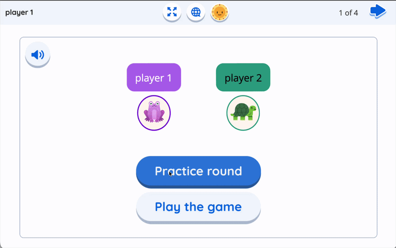
The early wireframes the PM is referencing.
Number of students staying in engaged with digital centers
(weekly)
Estimated number of design weeks saved per activity from strategic prototyping.
1-3
2,260
Approx. number of teacher prep hours (weekly) saved with digital centers
84K
Potential Impact
Goals of the Project
Address Feedback
Create a feature that allows students to be self sufficient while learning and playing, reduces or eliminates teacher pain points, and aligns with existing beloved print centers.
Prototype & Playtest
Create a MVP of a digital center to address pain points and put it in front of teachers and students to validate our assumptions.
Plan for Growth
Create a development plan with realistic scope and design guidelines to scale the digital template across all centers in the K-5 product.
Key Outcomes
Through prototyping and user testing, we validated these features as critical for a good user experience and scalability during development.
Created a risks/tradeoff report for the team to decide on the Virtual Tutor tutorial feature, weighing ease of build, user experience, and teacher-desired scaffolding.
Advocated to keep student interpretive feedback, a feature that teachers and students consistently loved in the core product.
Facilitated cross-functional conversations to align teams on strategic deviations from print games, where digital could do better
The Process
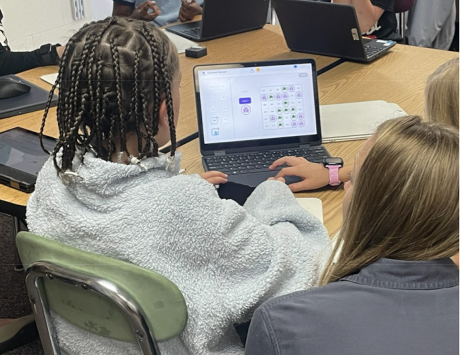
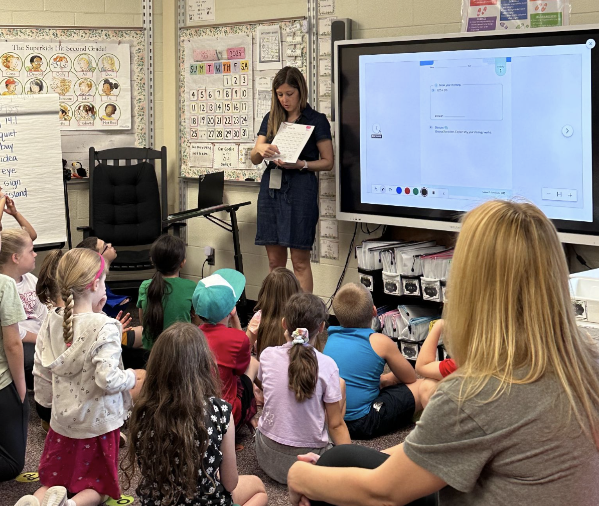
Through facilitated workshops and rapid prototyping cycles, I played a critical role on the team guiding us from concept to a scalable solution and drove our prototyping efforts through multiple testing rounds with real teachers and students. This back-and-forth approach helped us navigate the tricky balance between what teachers actually needed and what our platform could handle, which allowed us to create a framework that solved immediate pain points while enabling future curriculum expansion.
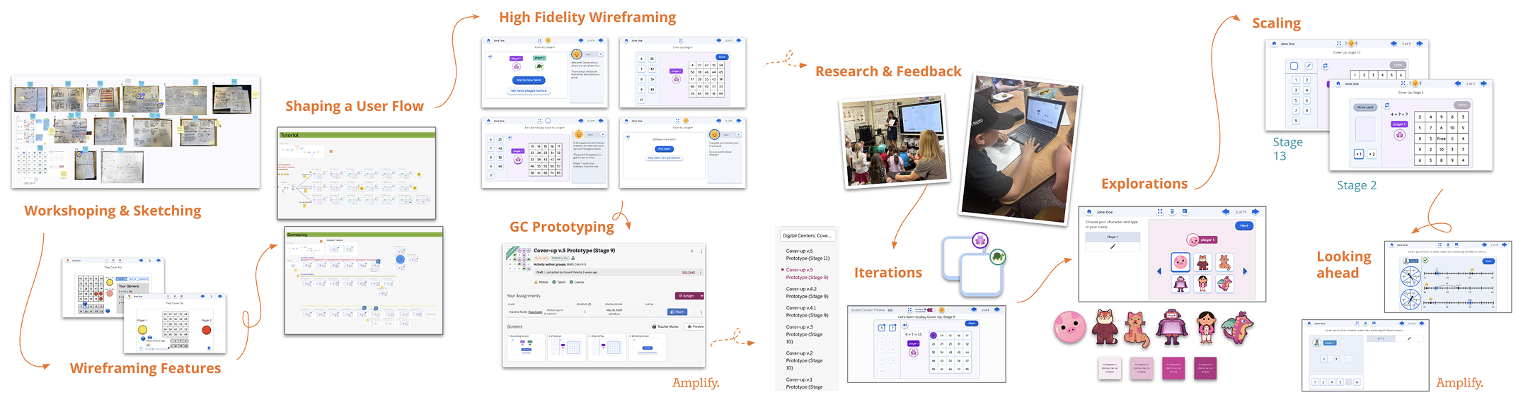
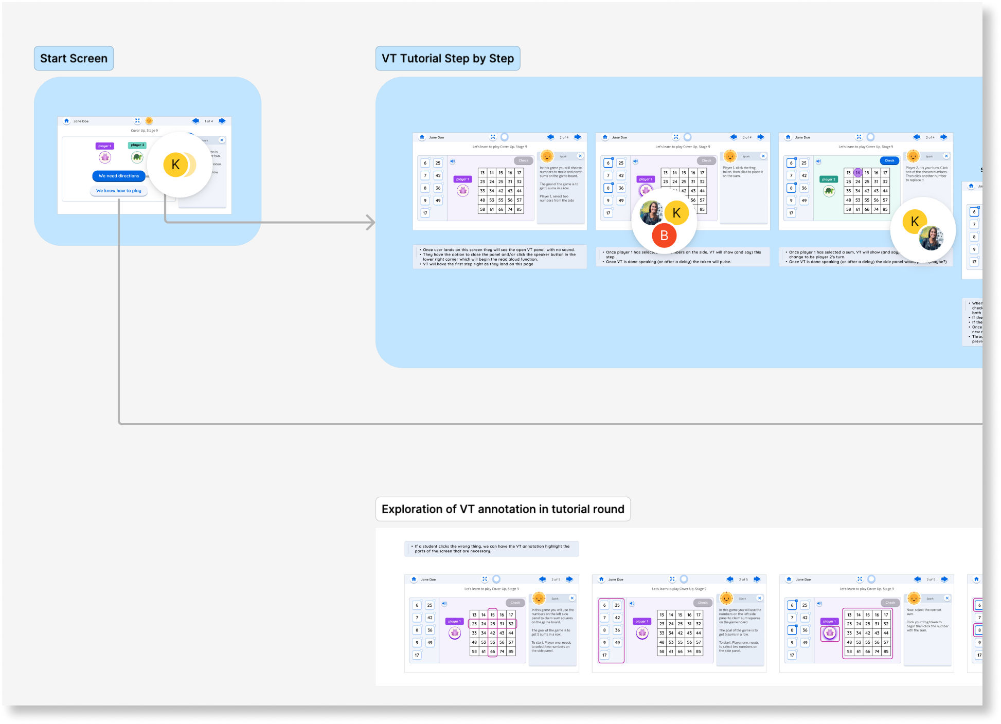
High level overview of the process, highlighting the outcomes of workshops, creation of design artifacts that helped shape the decisions, and critical moments of testing and iteration.
Along the way, I ran into some design challenges that required me to facilitate cross-functional decisions, drive strategic prioritization across the project, and influenced the team proactively to ensure accessibility throughout the prototype.
Design Challenges
Print to Digital Interface Translation
The Problem:
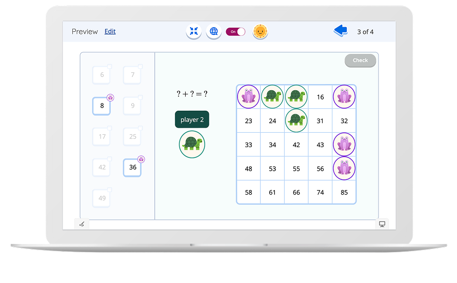
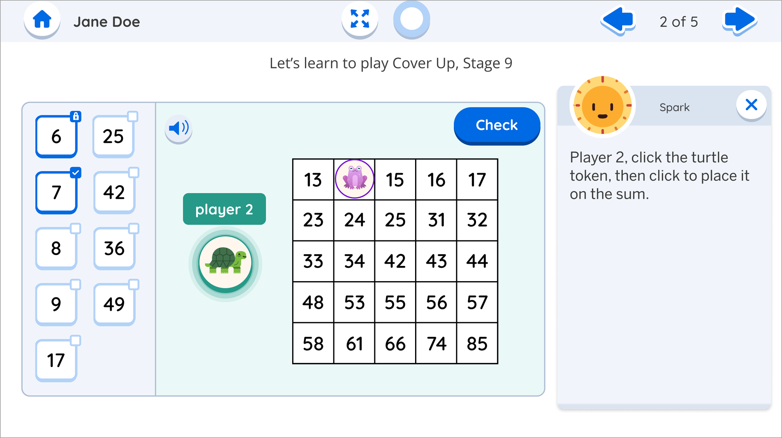
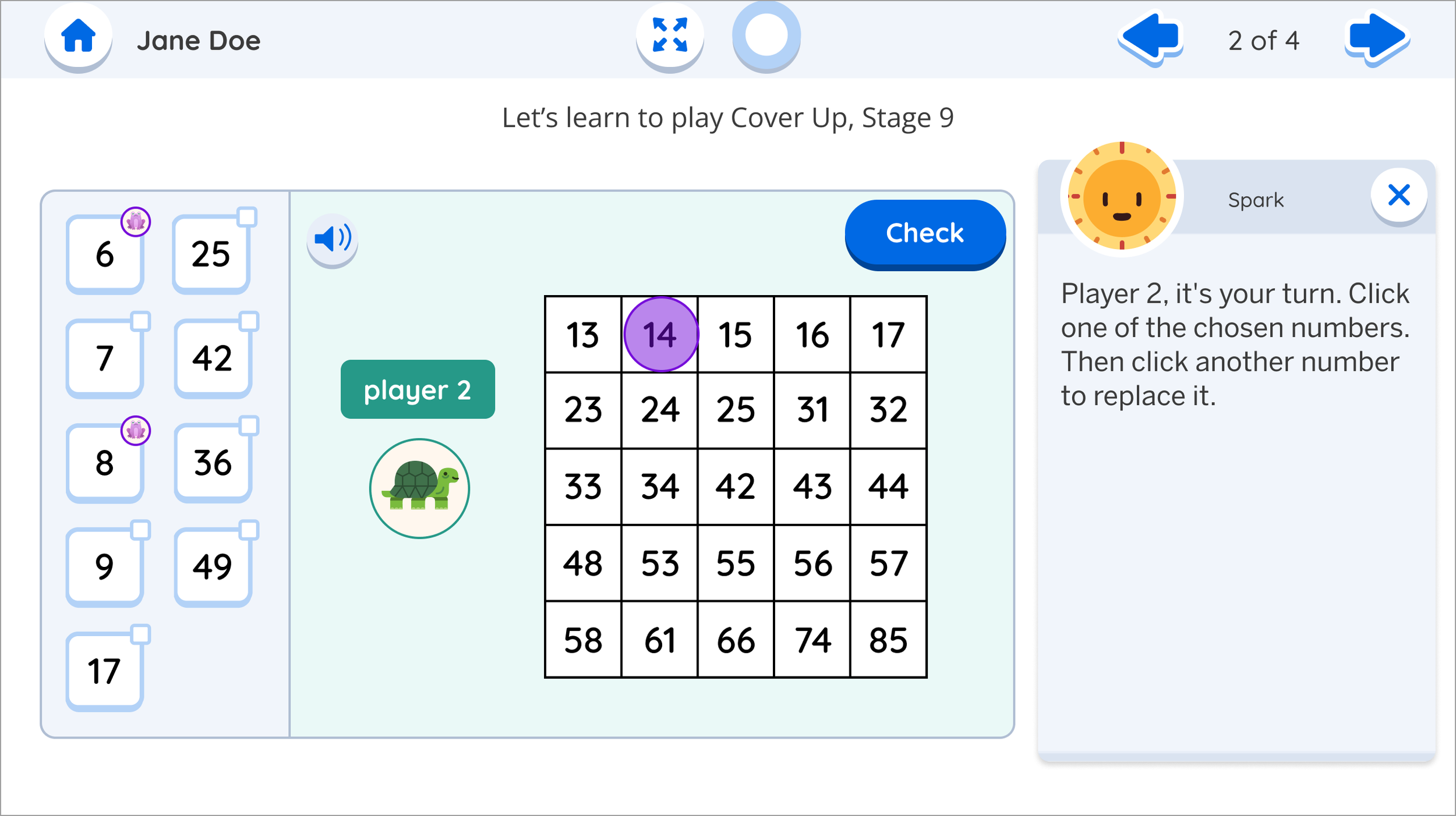
Translating a physical game mechanic to digital created a major usability barrier. In the print version, students placed physical cubes on numbers, then the next player simply moved one cube which was intuitive and tactile. Un-clicking and clicking to do the same action in digital made this feel clunky and confusing, undermining the benefit of a digital tool.
My solution, checkboxes to select numbers then click the sum, worked well initially, but broke down when Player 2 needed to "keep one of Player 1's numbers." The core game strategy required this constraint, but students couldn't understand why certain checkboxes would suddenly lock.
My Approach:
I created options with detailed pros/cons analysis and presented them to the team via a meeting and video walkthrough. Rather than pushing one solution,I laid out the facts, content trade-offs, and UX implications, facilitating a collaborative decision-making discussion that got everyone aligned on the core challenge we needed to solve.
I followed an iterative process based on the research:
First attempt: Rule change (rejected—needed content alignment with print)
Second attempt: Lock system on checkboxes (students confused by limitations and/or missed the lock symbol entirely)
Third attempt: Visual player tokens (better comprehension of symbol, still confused by the flow)
Breakthrough: Flipped the interaction from "uncheck what you don't want" to "click what you want to keep"
The Win:
This small instructional shift maintained game integrity while making the UI intuitive. Students immediately grasped the concept, and we preserved both the strategic gameplay and print curriculum alignment.
Impact:
Solved a critical usability barrier that could have derailed student engagement while maintaining educational goals.
Center Selection & Scaling Strategy
The Problem:
At the start of the project we needed to select a center to build a prototype around that balanced technical feasibility, scalability potential, and research value.
We only had limited time to build, test, and validate this feature before rapid development. Choosing a center to prototype without a solid strategy had thepotential to go past our deadlines, not gain the valuable insights to validate our assumptions forcing us to prototype again or potentially ship something that didn’t fully satisfy teacher needs. Something that was critical in our product lifecycle phase, newly launched and competing for market share.
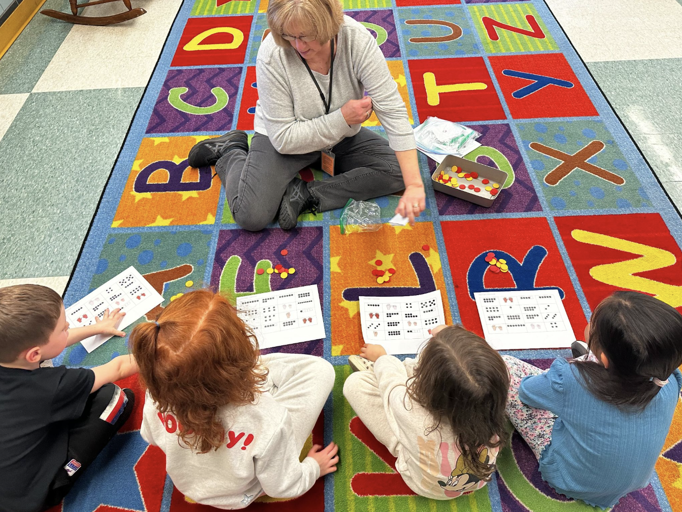
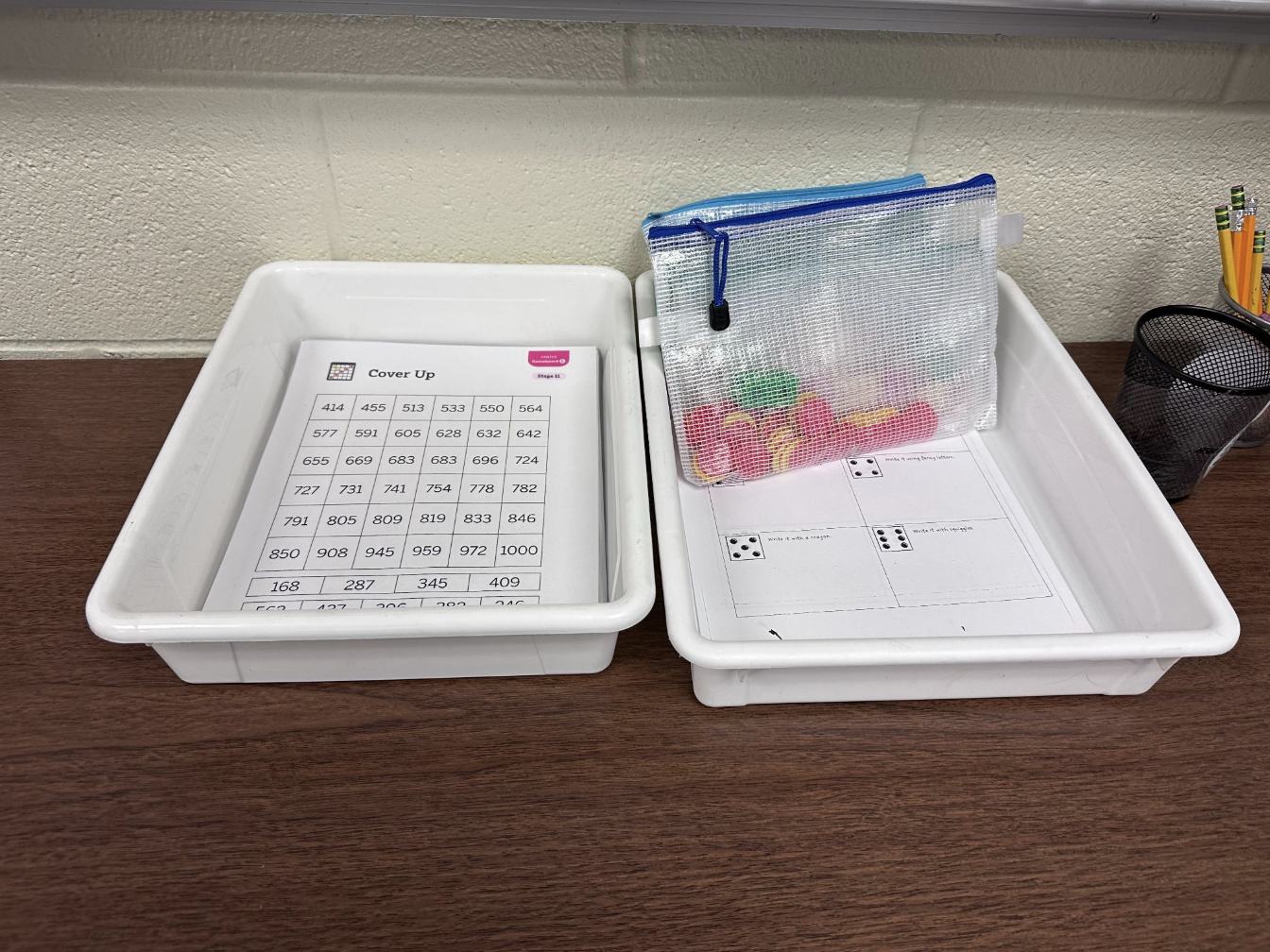
Snapshots of what physical centers looked like and the reality of what teachers were facing when demonstrating.
Video walk through explaining my design iterations, trade-offs, and UX implications for collaborative decision making.
Second attempt with lock system
Third attempt with player token
The final version with the flipped interaction.

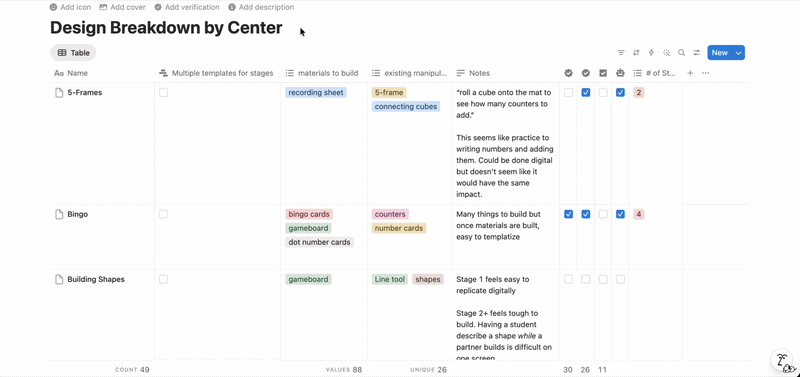
My audit database of all centers that I collected to analyze strategic factors.
My Approach:
I led the strategic selection of our prototype center from 48+ options by creating a systematic evaluation framework balancing the different objectives.
I created a comprehensive evaluation system analyzing:
Technical feasibility & build complexity
Template scalability across grade levels
Alignment with existing user patterns
Two-student, one-device collaboration constraints
Cross-team stakeholder priorities
I chose complexity over simplicity to maximize learning potential, balancing build feasibility with the need to stress-test our collaborative gameplay concept, something we'd never designed for our platform.
The Win:
My recommendation enabled us to validate the entire concept within our 2-month deadline, led to building a template that scaled to 11 additional templates in just 8 hours of design work, proving the collaborative gameplay model and opened opportunities for real-time partner technology which we previously didn’t have a compelling enough use case to build.
Impact:
One strategic center choice validated our entire concept, saving an estimated 1-3 weeks of design time per center, answered 5 critical research questions, provided development scoping insights, and created a scalable framework that influenced future platform architecture decisions.
Mentoring & Leadership
I mentored a junior designer through strategic color exploration to solve the visual disconnect between print materials and digital centers.
My challenge to her: explore solutions that would help teachers immediately recognize the correct digital center while considering technical implementation constraints.
When she presented initial concepts, I pushed her to think beyond safe solutions, encouraging her to explore higher-impact approaches that could enhance engagement, not just solve the identification problem. This collaborative iteration resulted in a more cohesive design system that improved both teacher usability and student engagement while maintaining technical feasibility.
Impact: Her final designs created stronger print-digital alignment and became a template for future center visual development.
Leadership & Collaboration

after
before
Strategic Team Education
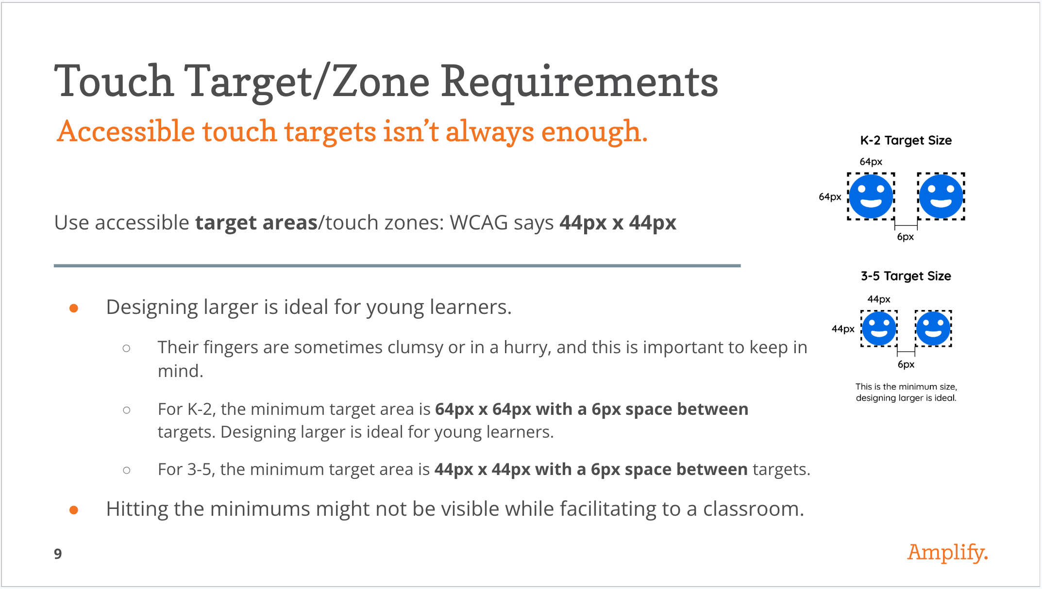
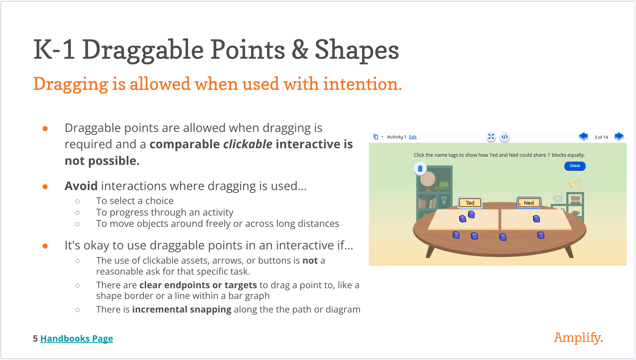
I presented accessibility guidelines to the entire team before ideation began, ensuring inclusive design principles were considered from concept through implementation rather than retrofitted later. This proactive approach prevented accessibility debt, streamlined our decision-making process, and established standards that influenced design choices throughout the project.
Impact: The team incorporated accessibility considerations naturally into brainstorming and design decisions, avoiding costly redesigns and ensuring our two-student, one-device solution worked for all learners.
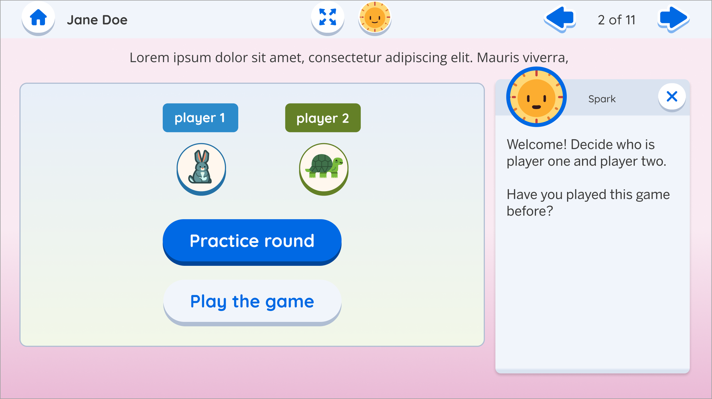
The prototype validated the concept. A scalable template with a virtual tutor, real-time student feedback, and intuitive game UI. Teachers loved it. Students wanted more. Budget went elsewhere.
A gif of the final prototype design
Looking Back
The decision not to move forward with Digital Centers wasn't a design failure. It was a resource reality. Amplify had invested heavily in building and launching a new product in a competitive market, and maintenance and new features had to compete for the same limited pool of development capacity. Budget went elsewhere.
What I'm proud of is that I didn't design for a perfect scenario. I designed knowing the path to production might be long. Before the project wrapped, I documented our open questions, codified the design and authoring guidelines, and left the work in a state where anyone could pick it up and continue without losing ground. Even if that was without me.
That's the thing about design work that doesn't ship: it either disappears or it waits. I made sure this one could wait.
Teachers loved it. The PM called it one of the most successful prototypes they'd seen the team develop. The concept is sound. The work is ready. When the business is ready too, so is this.
What People Are Saying About This Project
"It's kind of a complicated game, so having the self-correcting and kind of like the guide rails and like just it it was so explicit in the digital. I really liked it and they had so much fun playing."

- Grade 2 teacher after using the Digital Centers
“It was pretty fun - it was a lot more fun than the program we use in school, which is just really just answering questions.”

- Grade 3 student when asked about experience playing Digital Centers
“I've been going through and putting all the card sets that were rubber banded into baggies and labeling them and whatnot. And, I feel with kids that are like, not too careful with the supplies and then, you know, some get down and get on the floor , and you don't know which baggie it goes into. So that's one of the drawbacks of using the print, and the digital eliminates all that for sure.
- Grade 5 teacher after using the Digital Centers