
The Social Feature Fitness Apps Were Getting Wrong
When a PM asked for messaging features to increase engagement, I pushed back. The research showed the problem ran deeper than the feature request.
Overview
Most fitness apps approach social the same way. Friend feeds. Achievement notifications. Leaderboards. The assumption is that visibility creates accountability, and accountability drives engagement.
The research told a different story.
Role
Product Designer
Duration
6 Months
Team
N/A
Skills
Mobile UX/UI
Design
Prototyping
UX Research
Design Strategy
Context
This was a student project built around a hypothetical brief from a product manager. The research, participants, and design decisions were all real — 66 survey respondents, 5 user interviews, and two rounds of usability testing with real users.
People wanted social fitness. They just weren't getting it from the features that existed.
The brief was straightforward: a well-established fitness app was losing users after the first three weeks, and the PM wanted a new messaging feature to bring them back.
Before designing anything, I wanted to pressure-test the assumption.
I found that a “social feature” on a fitness app wasn’t as easy as messaging and feeds.
Fitness apps already had social features. Nike Run Club, Strava, Fitlist — all of them had feeds, leaderboards, notifications, and groups. If messaging was the answer, why wasn't it working?
I surveyed 66 users and found something that stopped me in my tracks: 48.5% of respondents said social aspects help them achieve their fitness goals, but only 21% actually used social features on fitness apps. That gap was the real problem.
That reframed everything. The PM wasn't wrong that social could drive engagement. The existing model of what social meant in a fitness app was just wrong.
The fitness app market was worth $4.74 billion in 2021 globally (when this project was performed), and retention was a defining challenge. On average, user engagement is heavy for the first three weeks and then drops off, leading to deletion.
Business Opportunity
The research reframed the problem entirely. Social motivation in fitness wasn't about visibility or comparison. It was about presence. Users didn't want to see what their friends had done. They wanted to do something together.

The shift from feeds and notifications toward features that created shared, real-time experiences.
Three features anchored the solution:
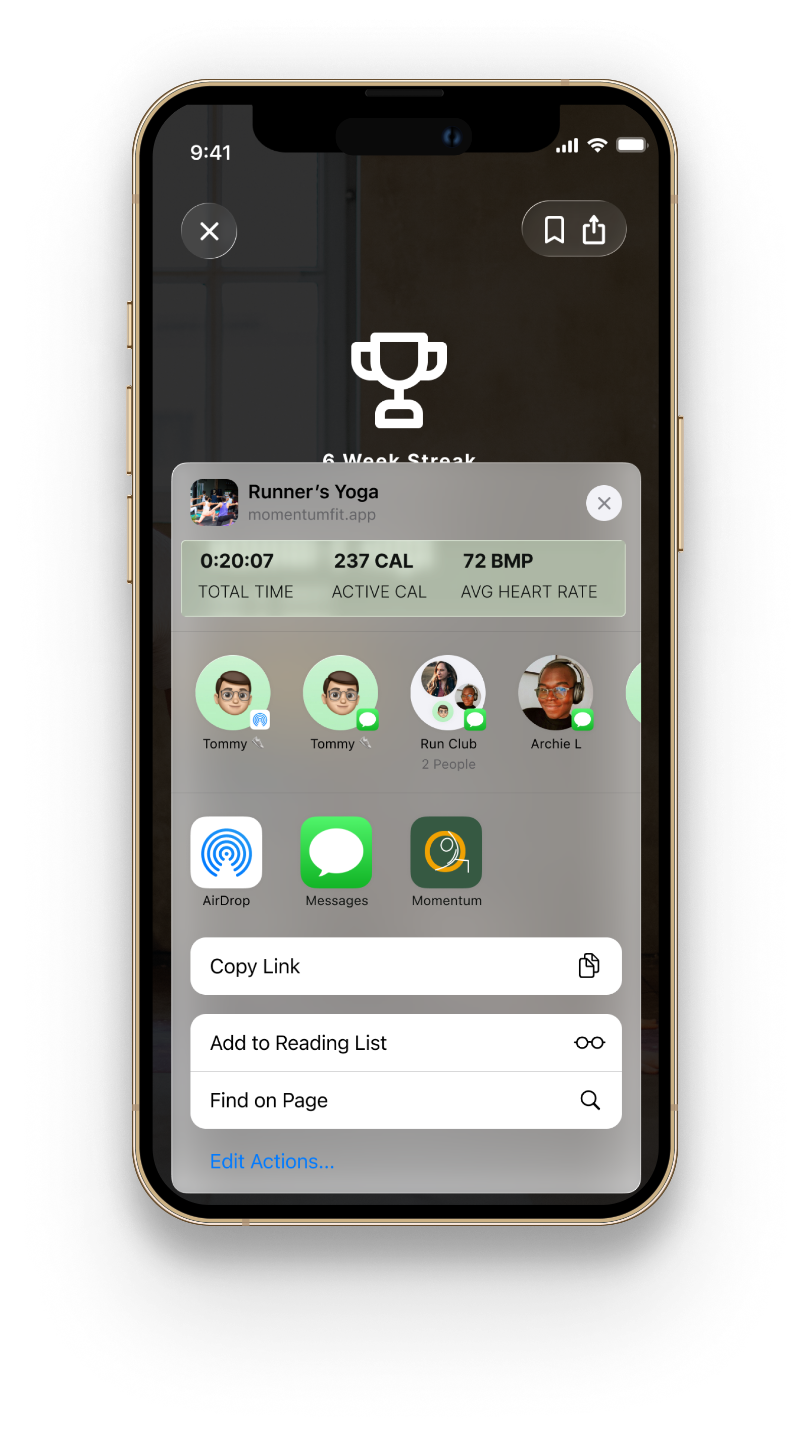
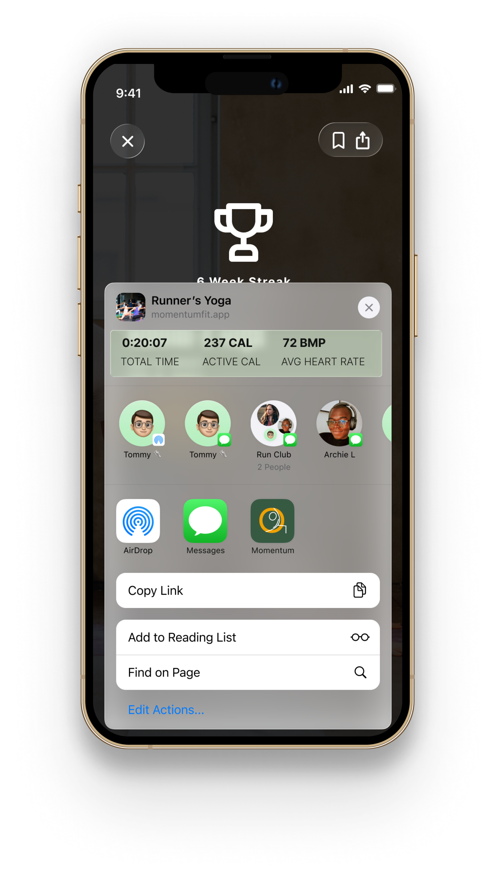
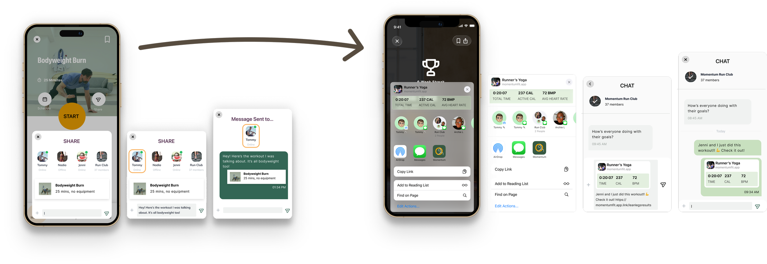
User Owned Sharing
A workout sharing flow that gave users control over when and how they shared results, built around familiar patterns from messaging apps rather than fitness-specific feeds.
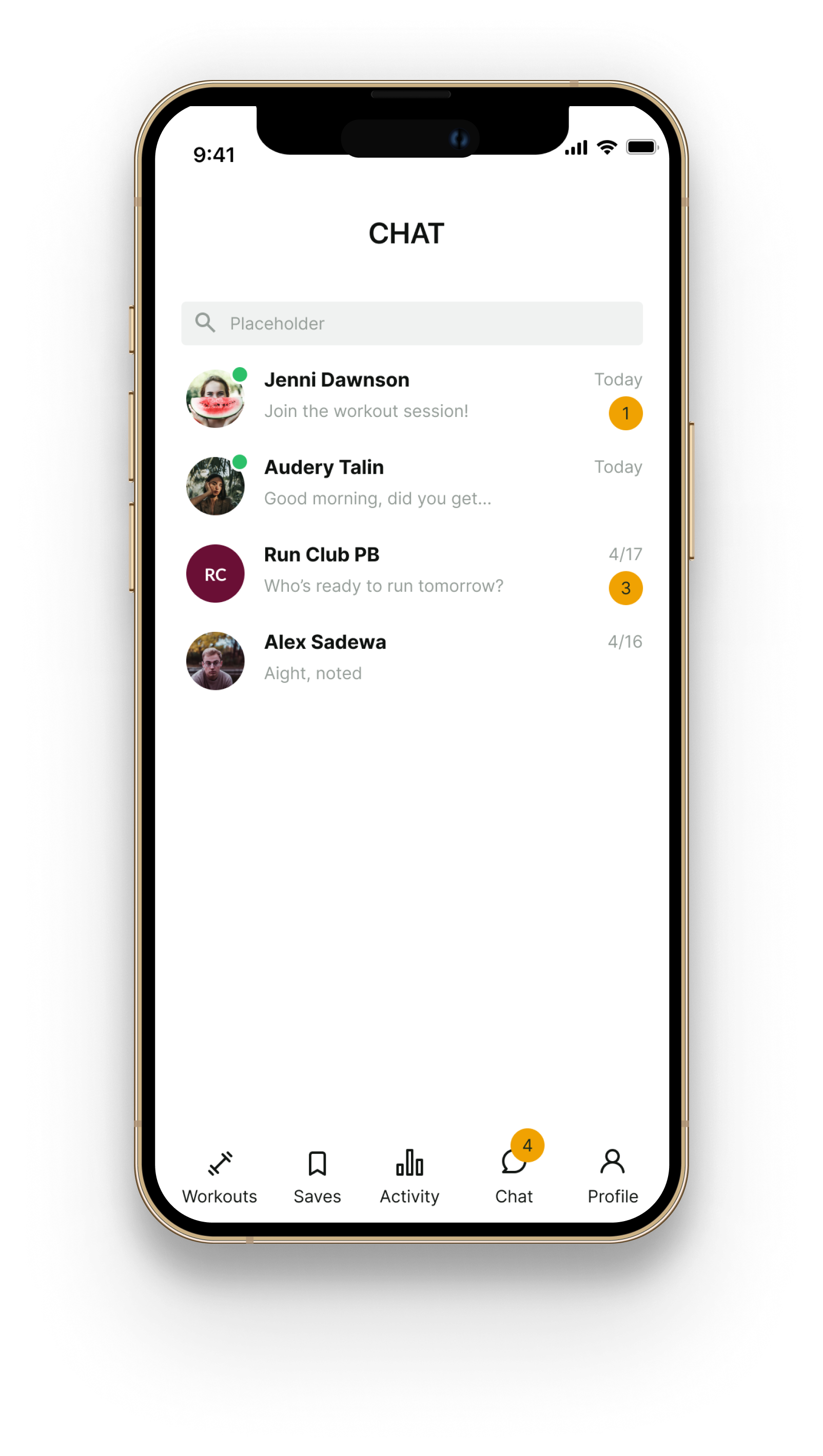
Direct Messaging
A chat feature that kept communication personal and direct rather than broadcasting to a group.
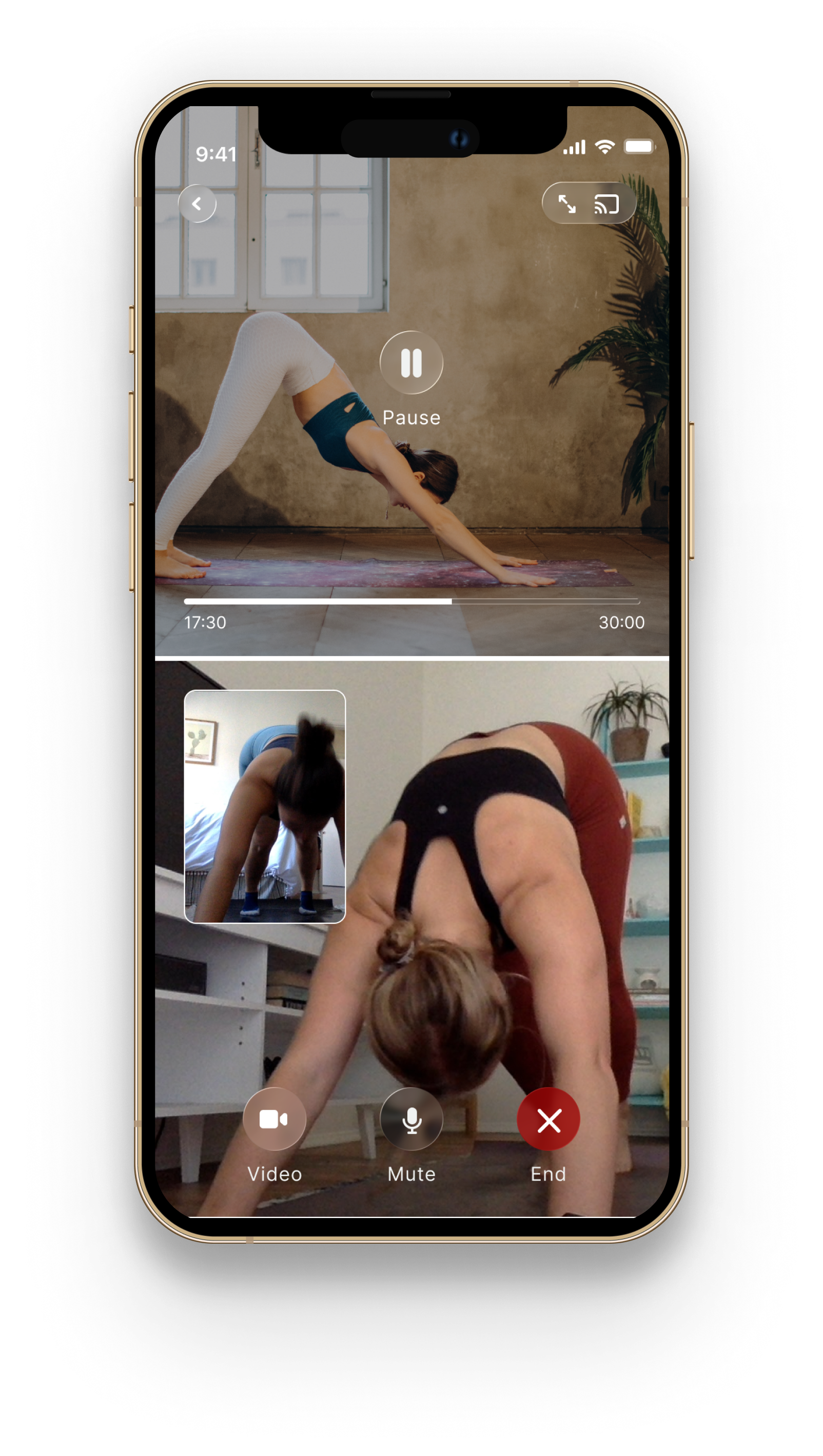
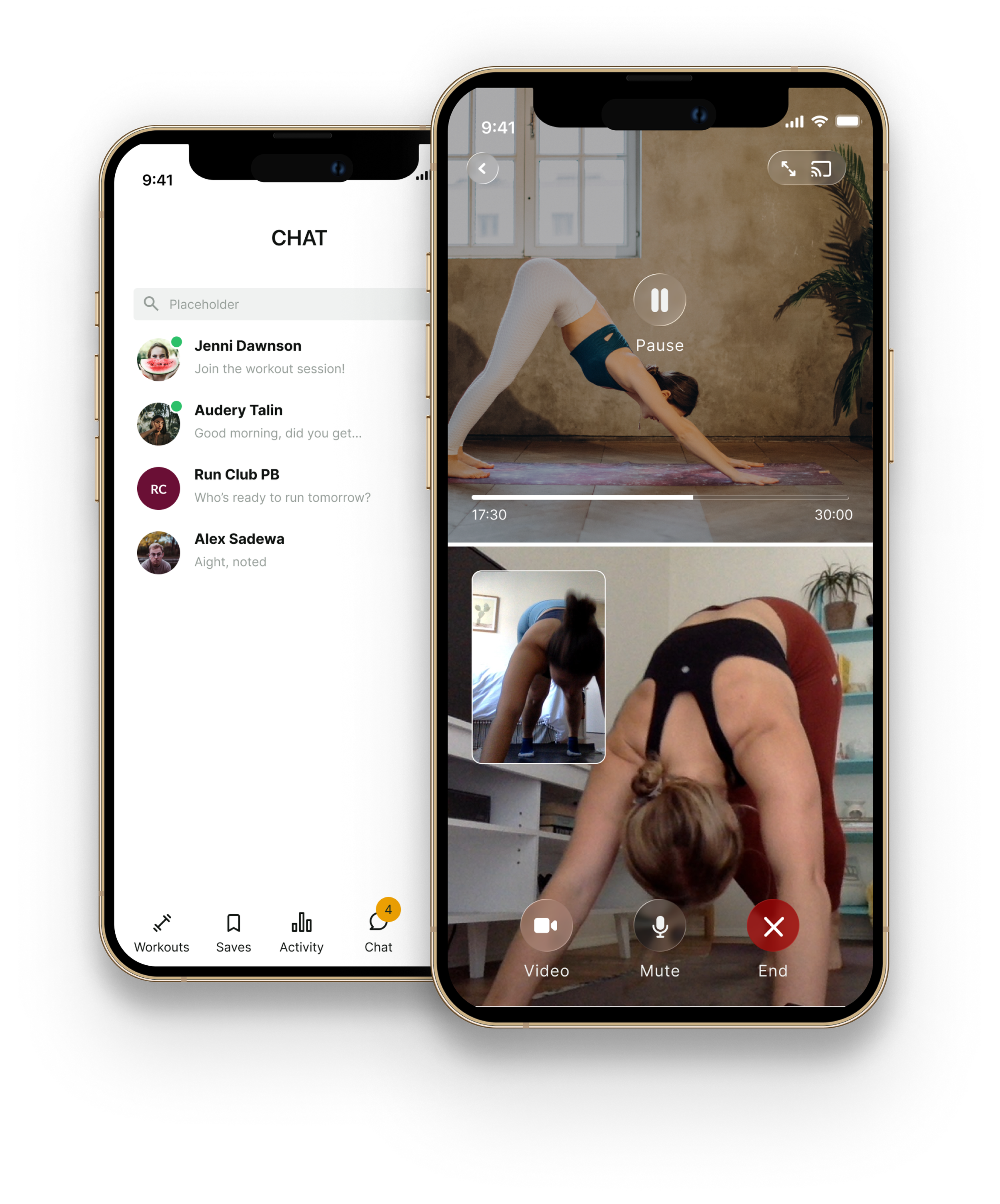
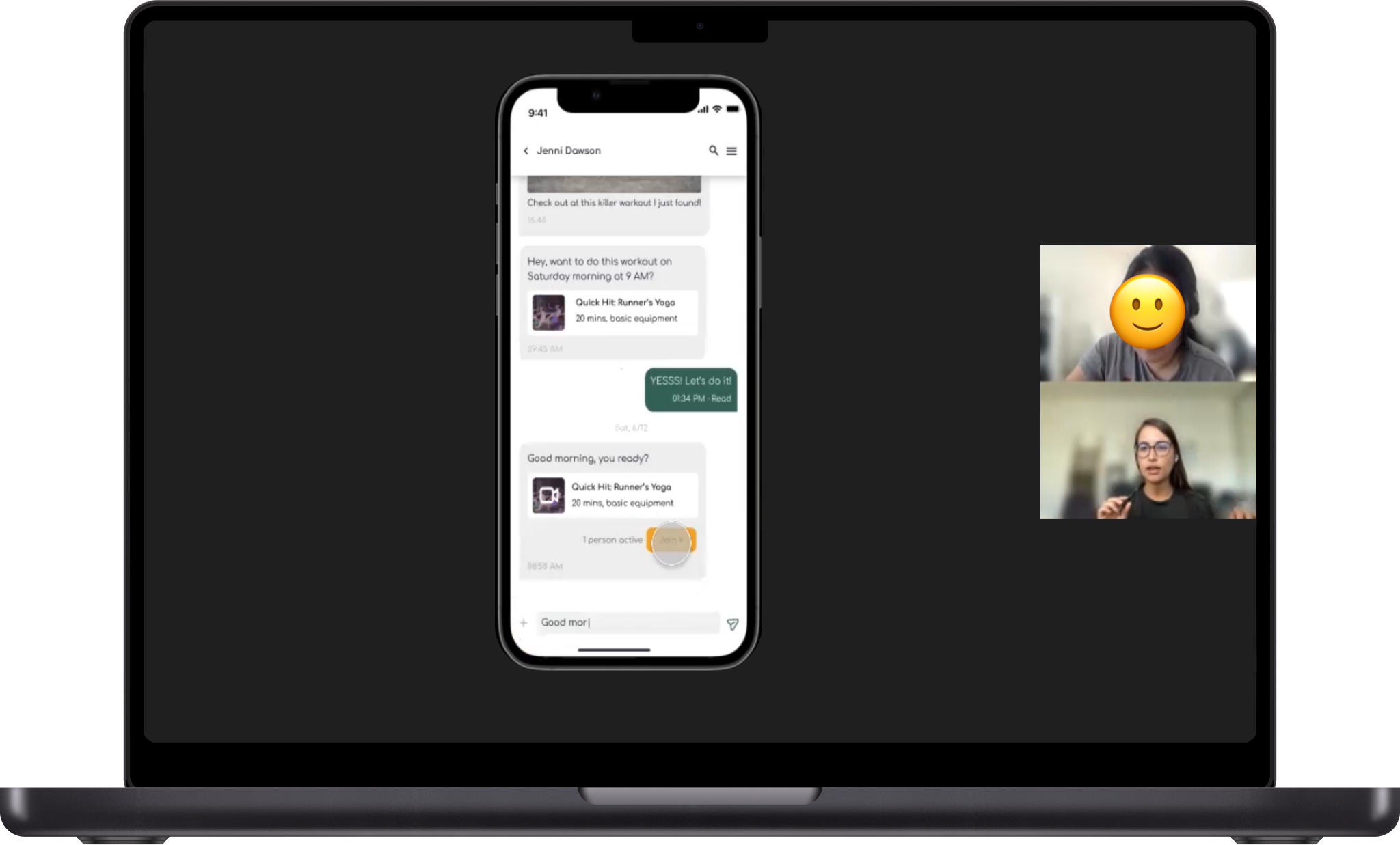
Video Call Workouts
A new feature that let two users do the same workout simultaneously over a live video call, replicating the energy and accountability of exercising with someone in person.
I replaced assumptions with evidence, even when the evidence surprised us.
Challenge
The insight driving this feature was simple: in a real fitness class, your friend isn't the main event. The instructor is. Your friend is there in your peripheral vision — someone to share the struggle with, check in on, hold you accountable by their mere presence. That's what makes in-person fitness social in a way that feels good rather than performative.
Solution
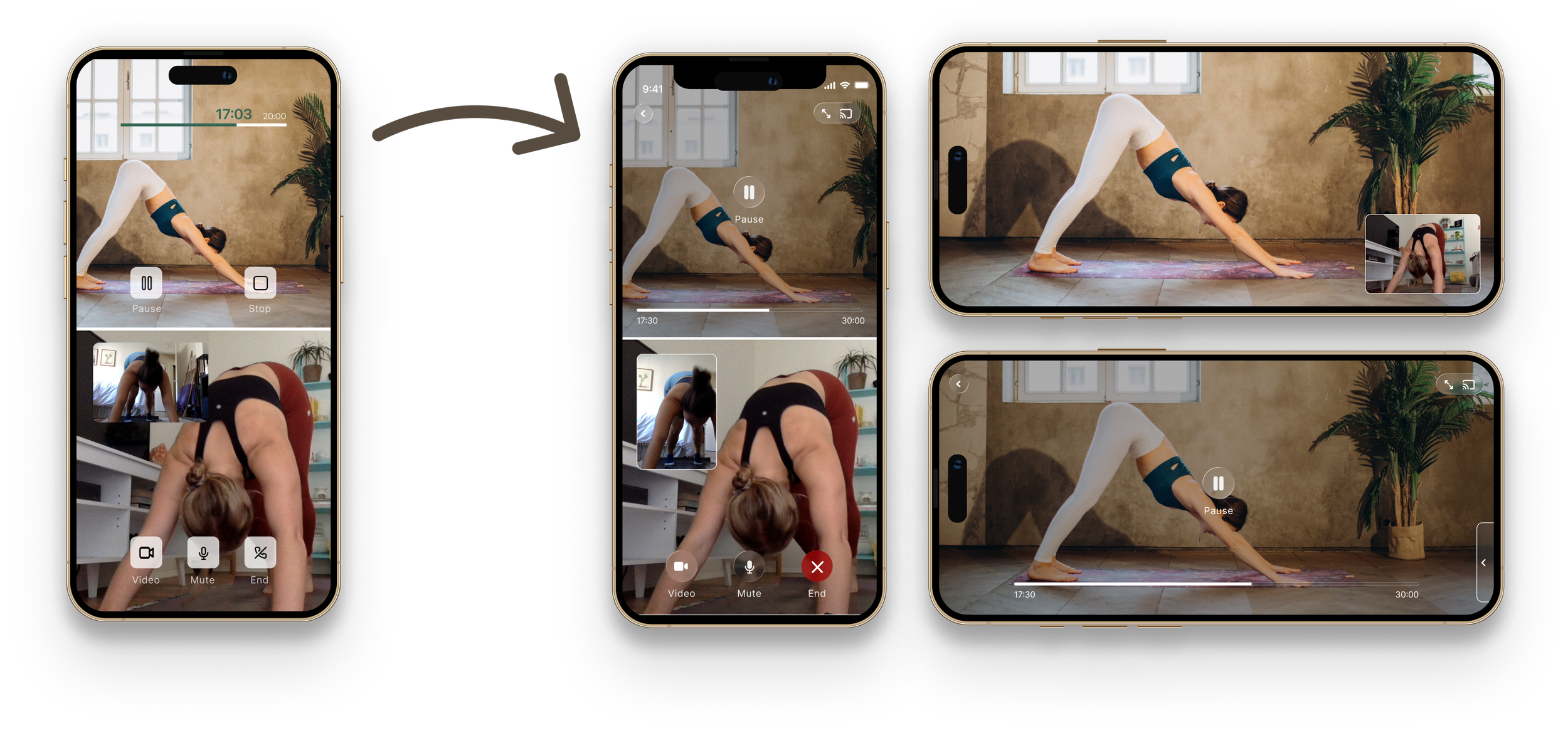
A split screen felt right immediately. Three elements needed to coexist: the workout video, your friend's live video, and your own camera feed.
The result mirrors how a real fitness class actually feels: you're there with someone, aware of them, energized by their presence, but both of you focused on the same thing.

I iterated to strike a balance around sharing features that felt more human than performative.
Challenge
The research was honest about something uncomfortable: most users didn't actually want to share their workout results. Notifications felt impersonal. Seeing someone else's stats on a bad day was discouraging.
But there were glimmers. When users did the same workout as a friend, sharing felt different. One user described how after an exhausting class, having a friend react to their stats felt genuinely encouraging. Context made sharing feel human instead of performative.
The real challenge was how to give users complete control over when, how, and with whom they shared.
Solution
The sharing flow I designed had three principles:
Preloaded messages with key stats. No typing required when you're exhausted.
Share to specific people, not a feed. The friend you just worked out with, not a public broadcast.
No defaults. Every share is a conscious choice.
This made it feel more like just texting a friend after a hard workout.
Two rounds of usability testing with real users validated the core concept and surfaced the iterations that made it stronger.
Video Calls
Early testing surfaced something I hadn't fully anticipated when designing. When watching a workout video, users instinctively wanted to flip their screen to landscape to focus on the content. The portrait split screen layout I'd designed suddenly felt constraining.
I added a landscape option and the ability to cast to a larger device. Simple additions, but they acknowledged something important: people work out in different environments and on different screens. A feature designed around connection shouldn't create friction around how someone actually wants to watch a workout.
Sharing flow
The first version of the sharing flow required too much navigation. Users knew they wanted to send something to a friend but couldn't find their way there intuitively.
I redesigned it around familiar patterns from messaging apps — a share sheet that felt immediately recognizable, a preloaded message with workout stats ready to send, and a customization option for users who wanted to add their own words. The result was guided navigation that eliminated confusion while still giving users control over what they sent and who they sent it to.
The video call workout feature was the clearest win.
The sharing flow landed well after iteration. Logical navigation and clear affordances weren't nice-to-haves. The next step would be an A/B test against existing social features to measure whether these features actually moved the engagement needle over time.
Video Calls: VALIDATED
Even participants who rarely worked out with friends and didn't expect to want this feature responded positively. The flexibility was the key — it let them fit a shared workout into their existing schedule and habits rather than requiring them to change how they worked out. The concept of presence without logistical friction resonated.

Sharing Flow: VALIDATED
The sharing flow landed well after iteration. Users appreciated that a preloaded message appeared automatically but could be customized. Navigation confusion dropped significantly after redesigning around familiar messaging app patterns. Users found it easy, intuitive, and said they'd use it to stay connected and motivated
If I were approaching this problem today I'd want to start over on the research. Social as the primary retention lever made sense in 2021. Now I'm not so sure.
This project has strong bones. The research approach was rigorous for a one-month student project, the core insight about presence over visibility still feels true, and the video call workout concept has aged well. Virtual connection became a habit during the pandemic and never fully went away.
But the landscape has changed dramatically. The global fitness app market was worth $4.74 billion in 2021. By 2025 it had grown to $12.12 billion. The competitive field is unrecognizable compared to when I designed this.
If I were approaching this problem today I'd want to start over on the research. Social as the primary retention lever made sense in 2021. Now I'm not so sure. The fitness apps that have won since then — Ladder, Runna, and Nike Run Club — have focused less on social and more on personalization, reduced cognitive load, and fitting seamlessly into how people actually live. The information age is exhausting. Maybe the retention problem was never really about social. Maybe it was about making the right workout feel effortless to find and follow.
I'd want to test that hypothesis before designing a single screen.